
Futura
Tech Labs
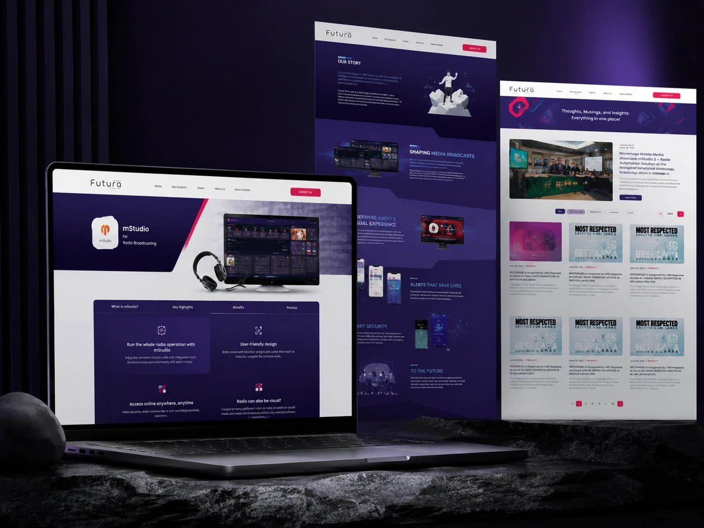
Designing a futuristic digital home for Asia's leading broadcast technology company.
The Project
Futura Tech Labs — formerly Microimage Mobile Media — is a Sri Lanka-based technology company that has been building media broadcasting, smart security, and disaster warning solutions for over 15 years. Their products run across key networks in Sri Lanka, Malaysia, and Brunei, trusted by broadcasters, governments, and enterprises across Asia.
In 2022, the company rebranded and needed a completely new website that matched their new identity — bold, futuristic, and technically credible. The ask was clear: build something uncommon. Something that felt as advanced as the products behind it.
Scope
- Full UX + UI design for a 15+ page website
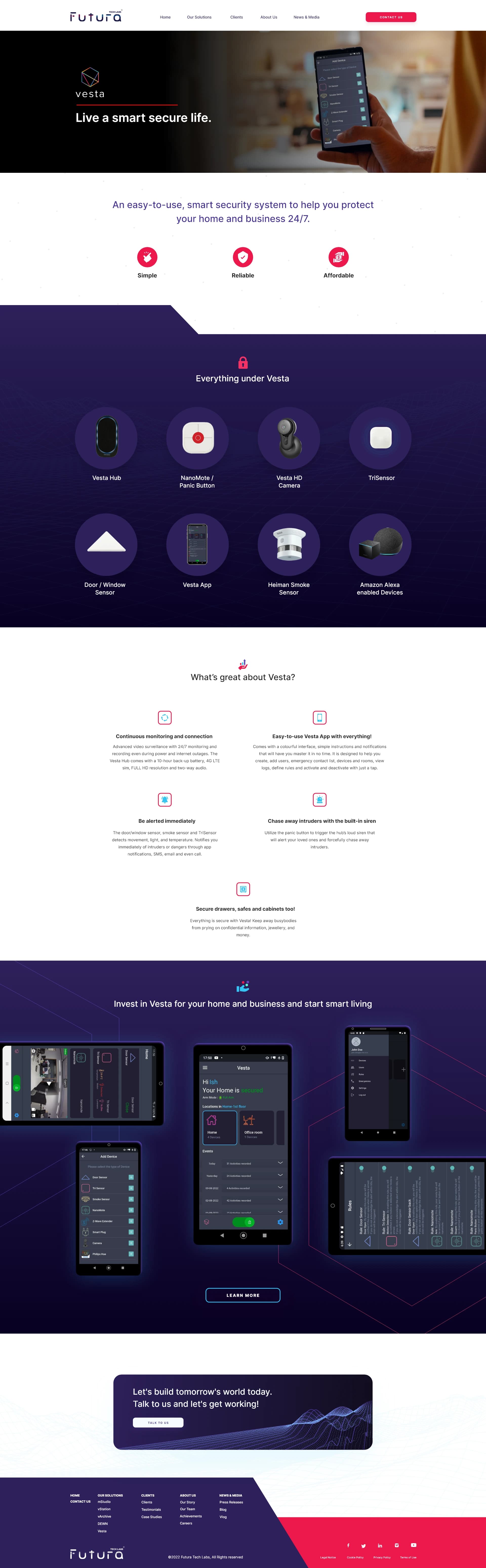
- 4 product pages with deep feature documentation
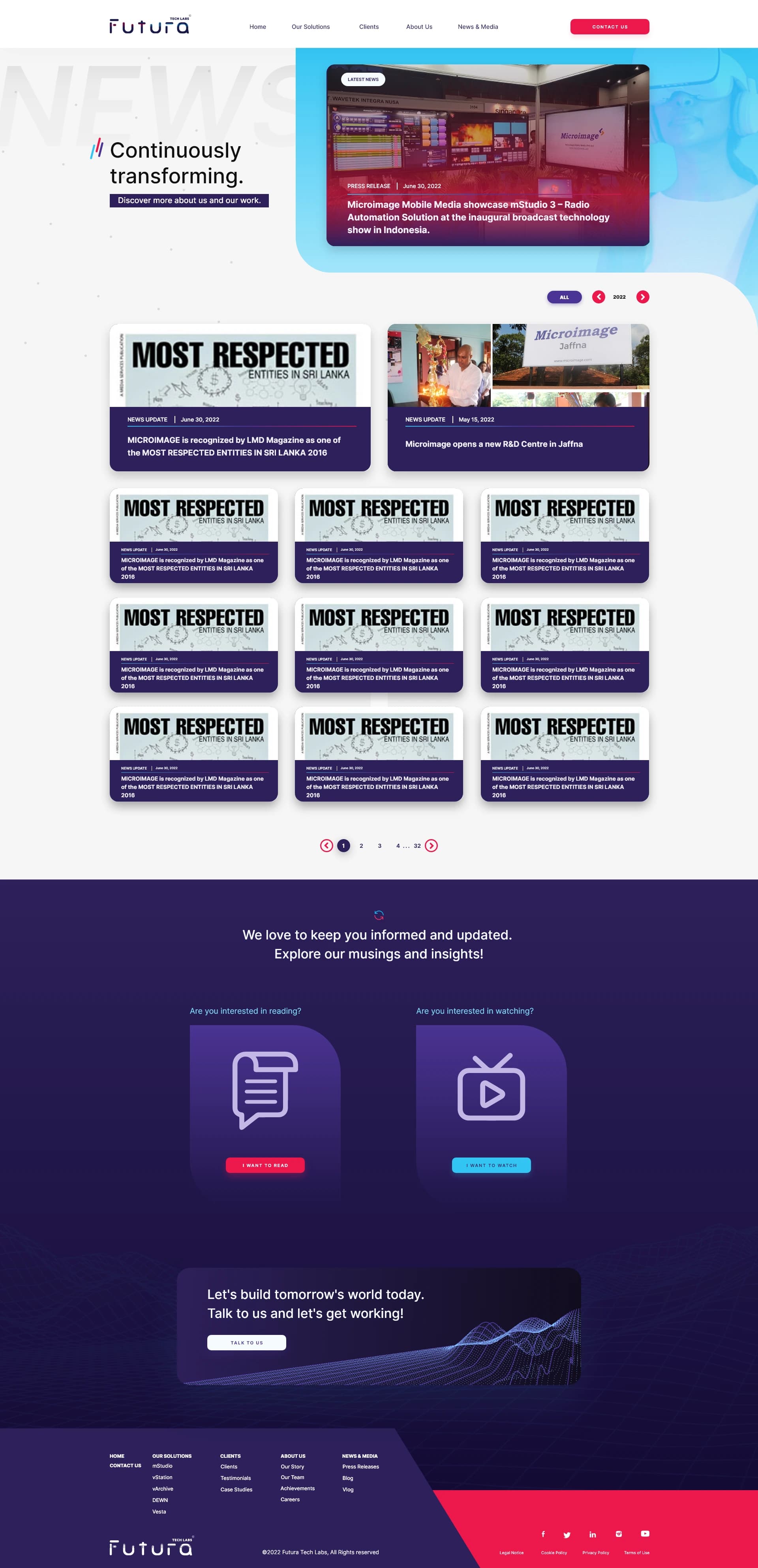
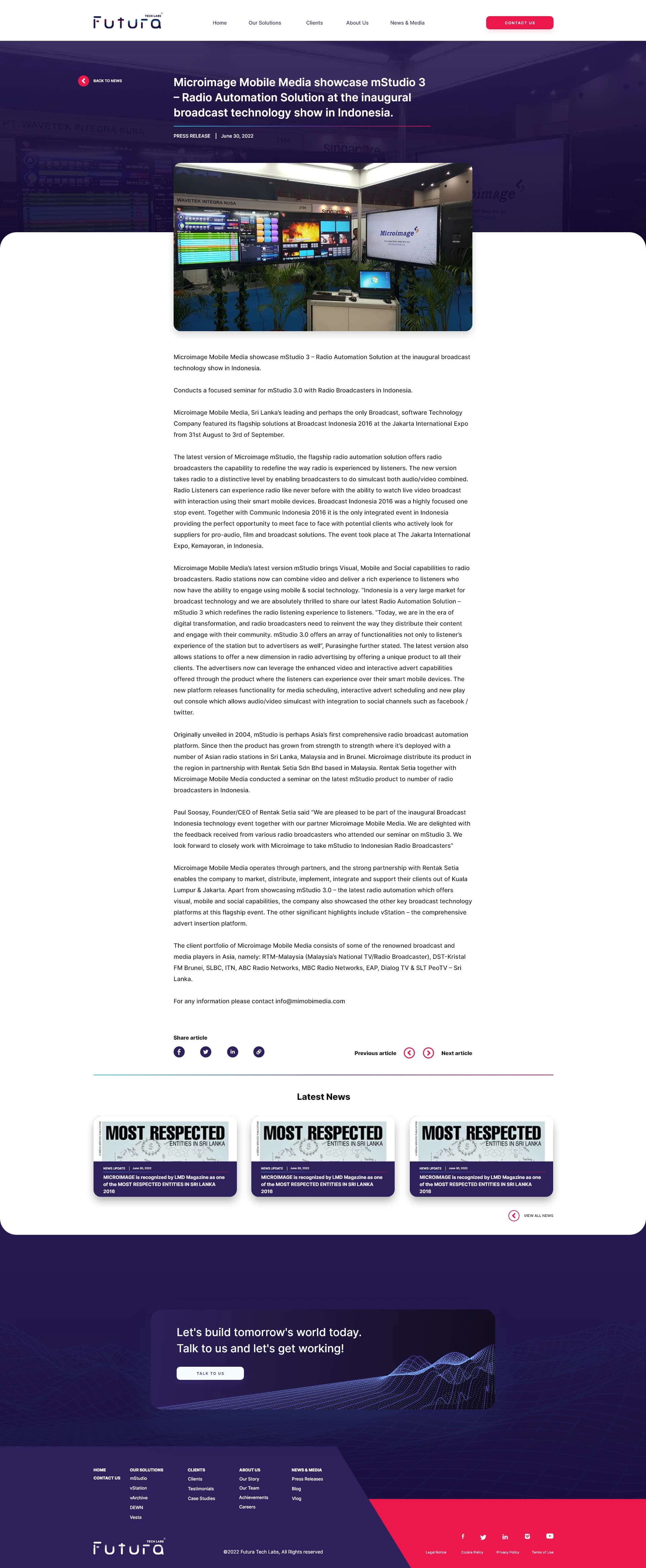
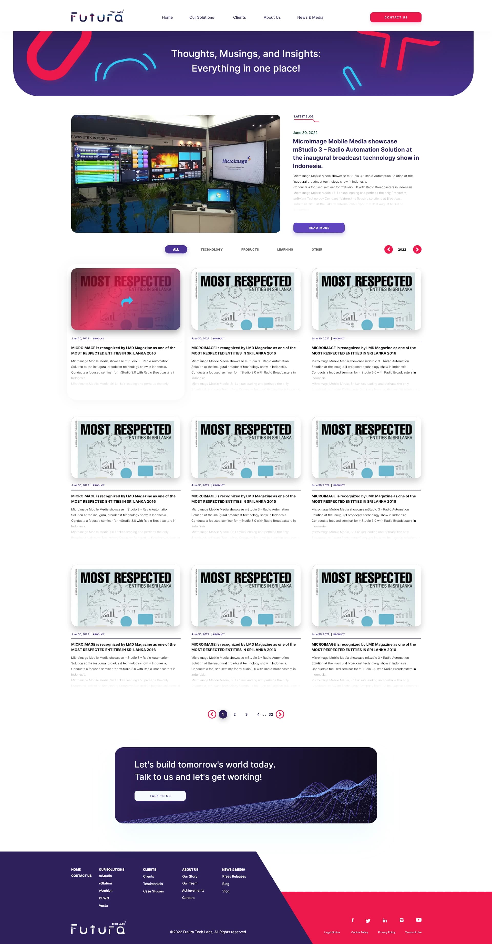
- News, Blog, About, Contact, and Clients sections
- Designed in Adobe XD, developed in WordPress + Elementor
- Handed over to Futura's internal team after launch

Project Info
- Client
- Futura Tech Labs Pvt Ltd
- Industry
- Broadcast Technology / SaaS
- Location
- Singapore + Sri Lanka
- Year
- 2022
- My Role
- UX + UI Design
- Tools
- Adobe XD · Creative Suite
- Built With
- WordPress + Elementor
- Pages
- 15+ designed
- Products
- 4 enterprise products
- Status
- Launched Aug 18, 2022
The Problem
The core challenge wasn't
aesthetics — it was architecture.
Futura had four very different enterprise products under one brand umbrella. Each had its own identity, audience, feature depth, and visual language — yet all needed to feel part of the same bold, credible company.

mStudio
Radio Broadcasting Automation
vStation
TV Broadcasting Automation

DEWN
Disaster Early Warning Network
Vesta
Smart Security & Home Automation
Content depth vs clarity
mStudio alone had 11 sub-modules. How do you present enterprise-grade feature depth without overwhelming visitors who just arrived on your homepage?
Multi-audience site
The site needed to simultaneously speak to radio station managers, TV broadcasters, government disaster officials, and homeowners — all with different needs and vocabulary.
Rebranding in progress
The company was transitioning from a well-known legacy brand. The site had to honour 15 years of history while signalling a bold new chapter under the Futura name.
Client's brief
"We want something futuristic and uncommon. Not another boring tech website." A brief that's easy to say, hard to execute without falling into generic design clichés.
The Process
How it came together.
Understanding the Products
Before touching a single artboard, I worked through Futura's comprehensive content brief — a detailed document covering all 4 products, page flows, navigation structure, copy, and feature lists. Wireframes were co-created collaboratively within that document, meeting the client's preferred working method rather than imposing a design-only workflow.
Information Architecture
The navigation structure needed to handle 4 distinct product lines without creating confusion. Every product had its own audience and entry point, so the sitemap was built to guide different visitor types cleanly.
Site architecture
Structure at a glance
11
Total pages
2
Nav levels
4
Products
Page types
Primary entry points
Product Page Pattern
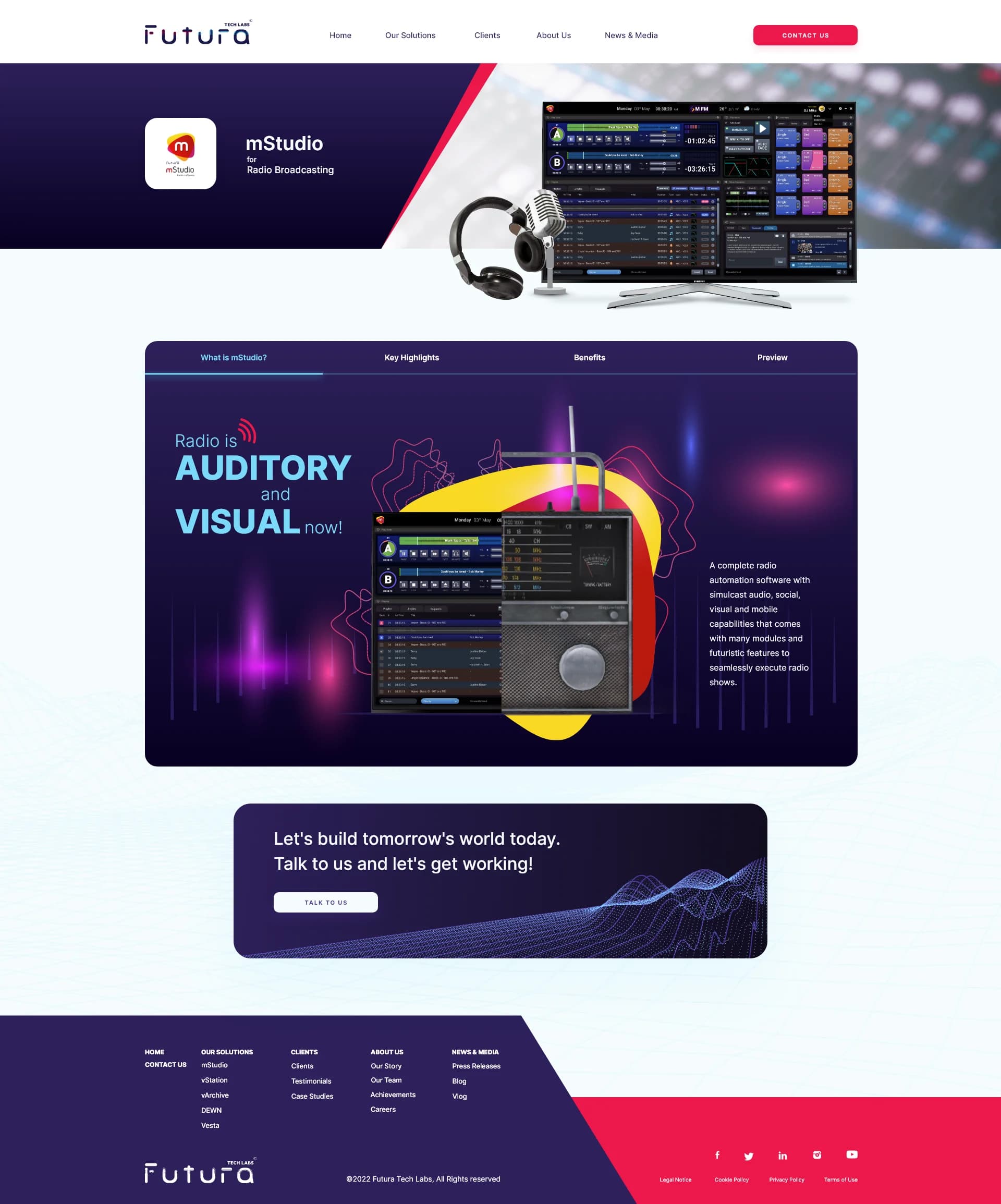
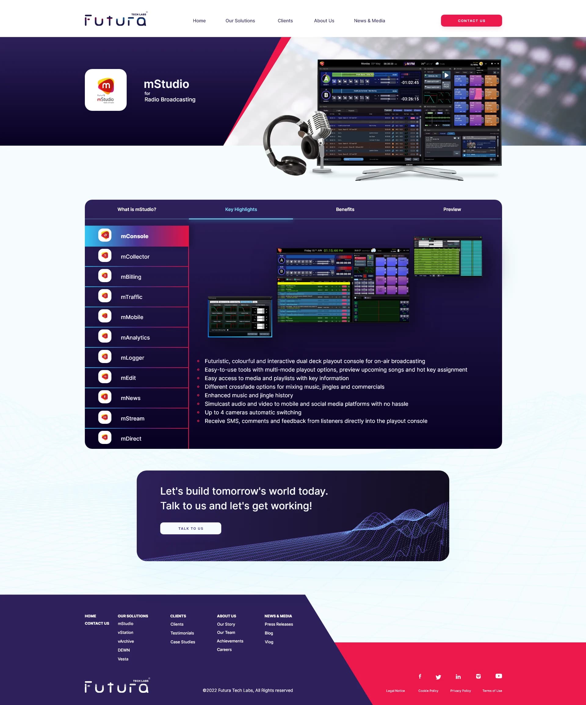
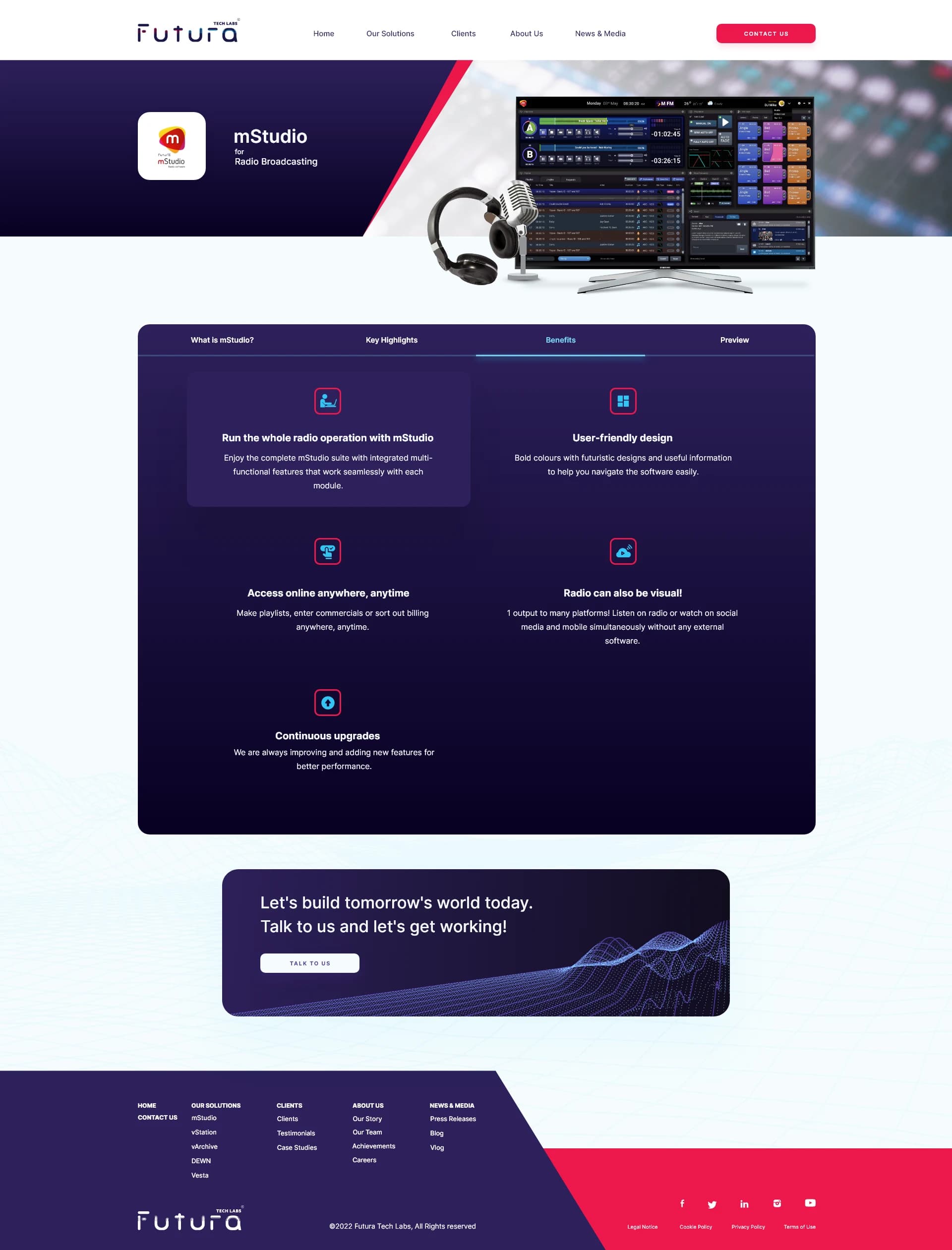
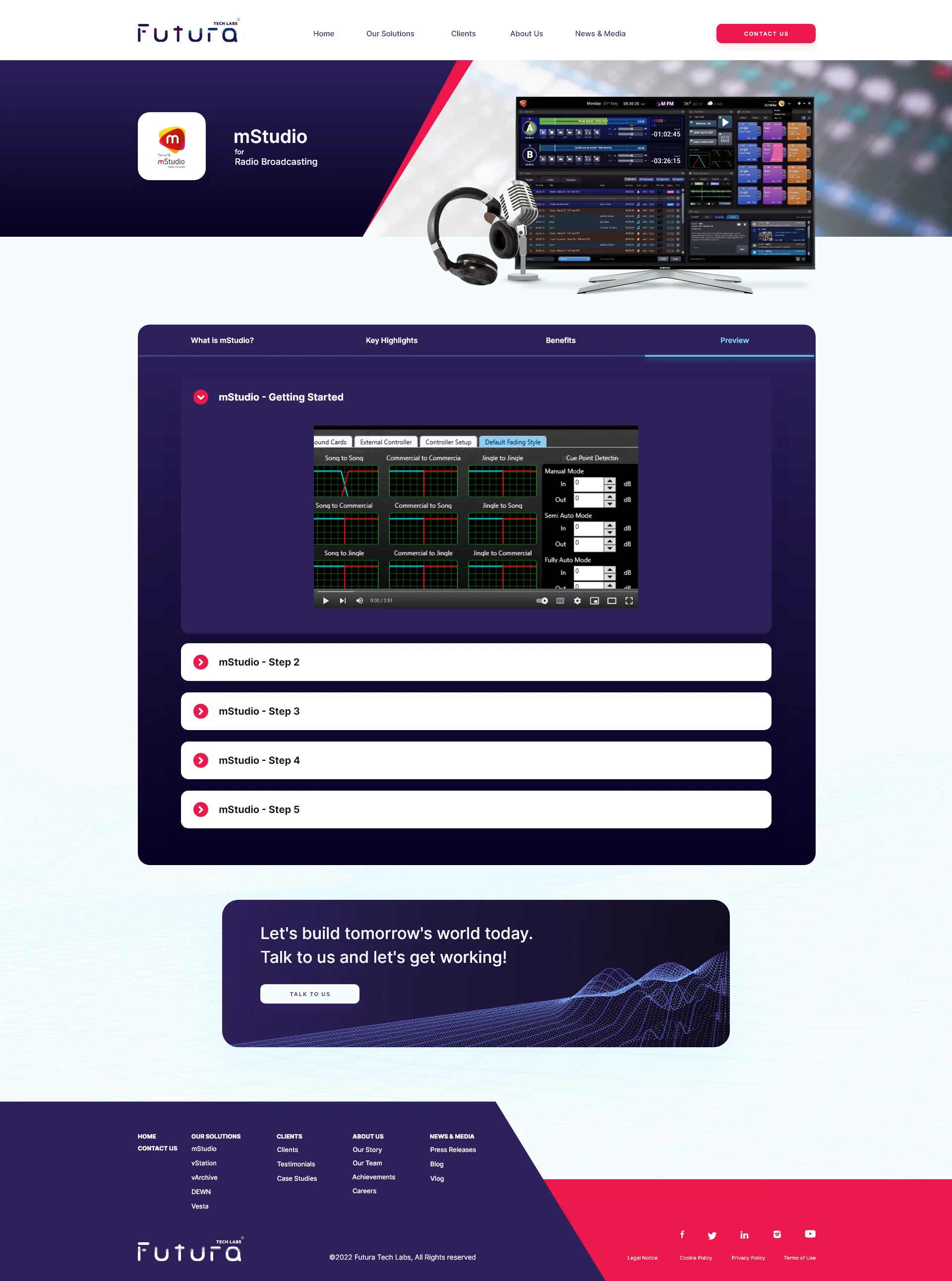
mStudio alone had 11 sub-modules. To handle that depth without creating endless scroll or confusing sub-pages, I designed a tabbed content system within each product page: Tab 1 — What is [Product]? · Tab 2 — Key Highlights · Tab 3 — Benefits · Tab 4 — Preview. This pattern became the reusable foundation across all 4 products.
Visual Direction
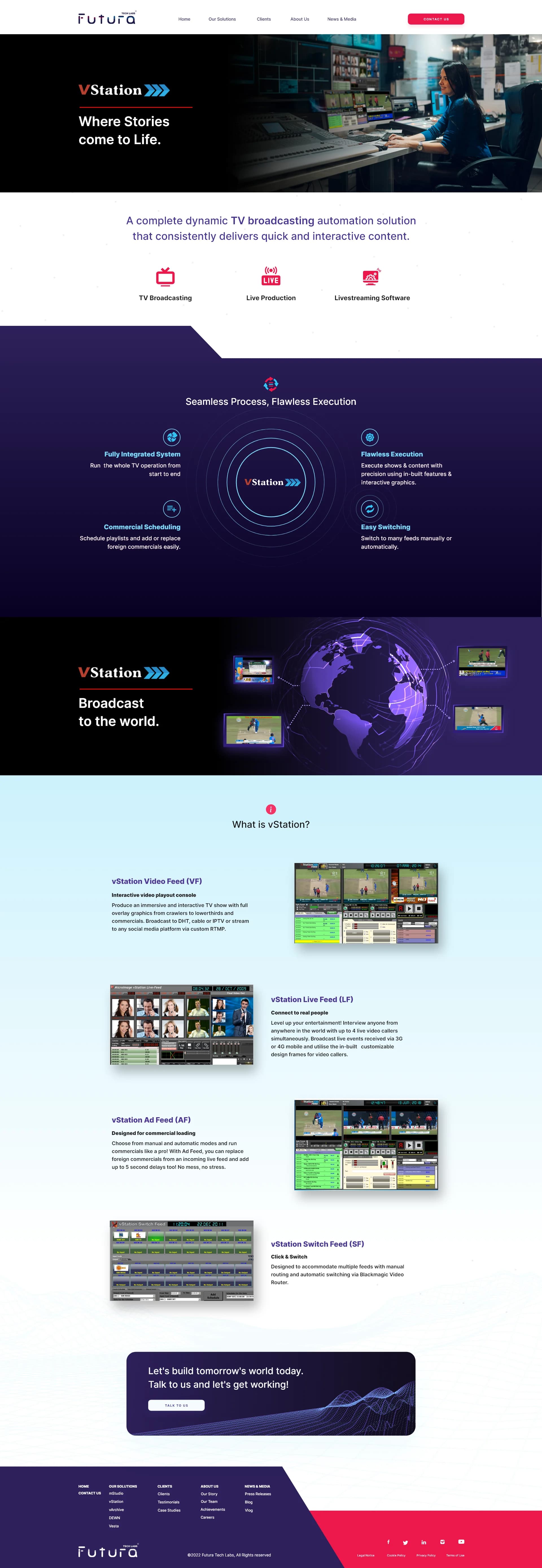
The client's brief was unambiguous: futuristic and uncommon. The design language was built around a deep navy/dark purple environment for authority, crimson red as the energy accent, diagonal section cuts as the site's signature structural element, and dot grid textures for a subtle technical feel. Product photography and real UI mockups grounded everything in reality.
Designing 15+ Pages
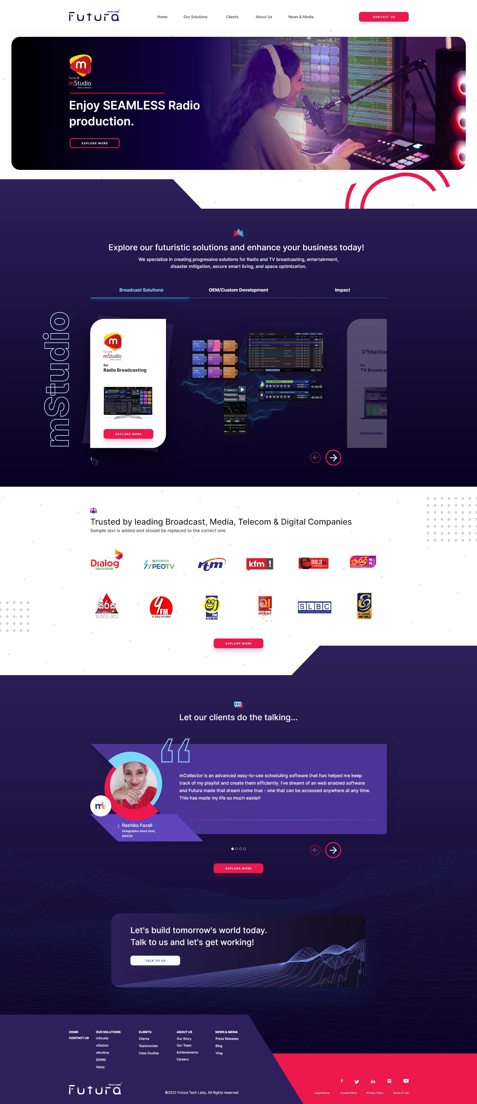
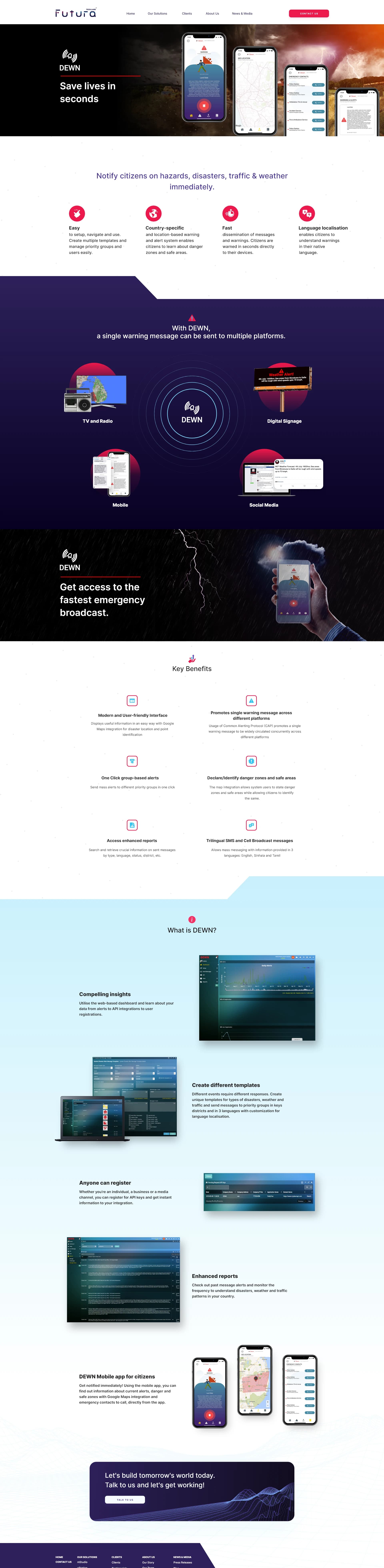
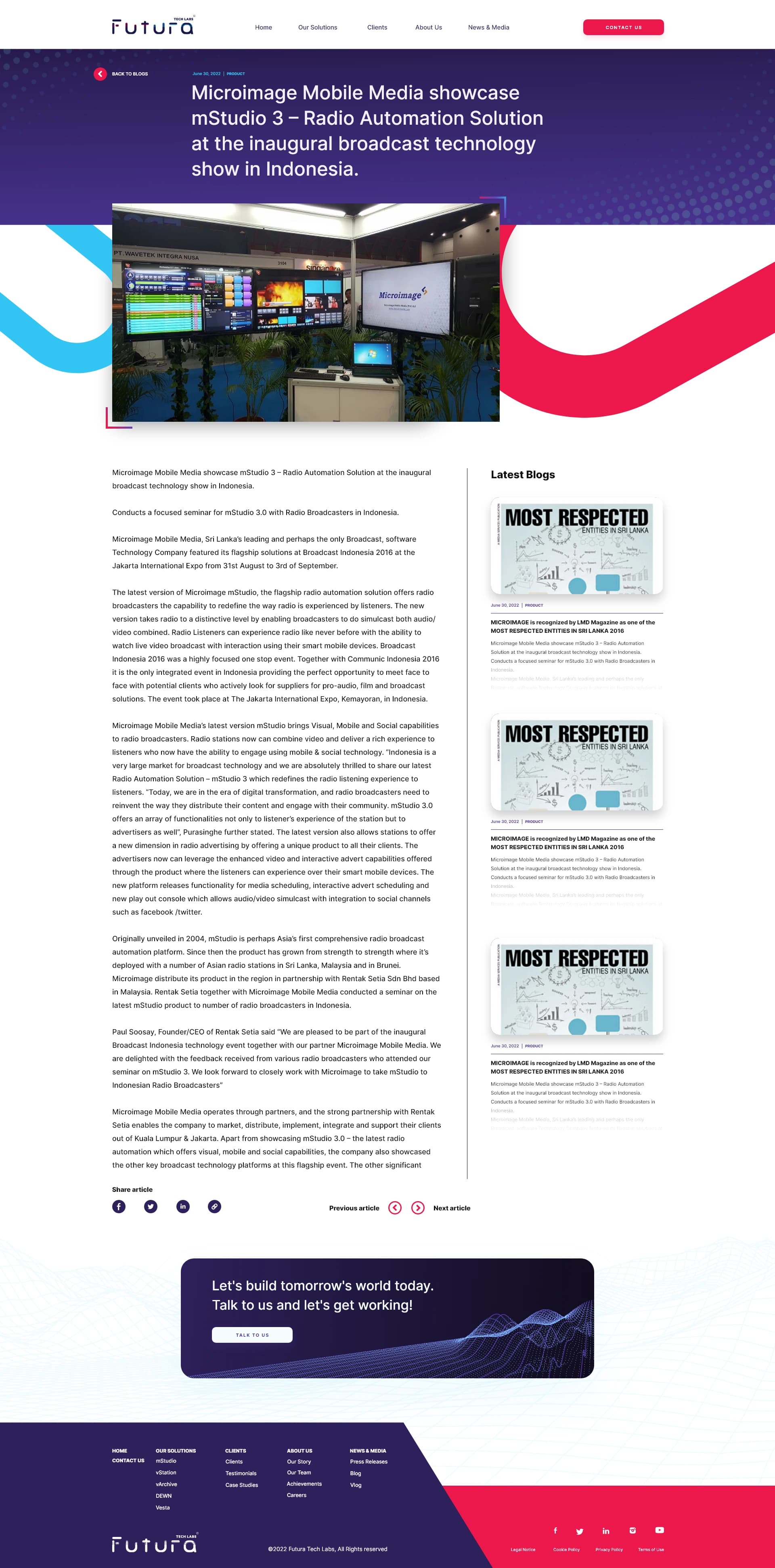
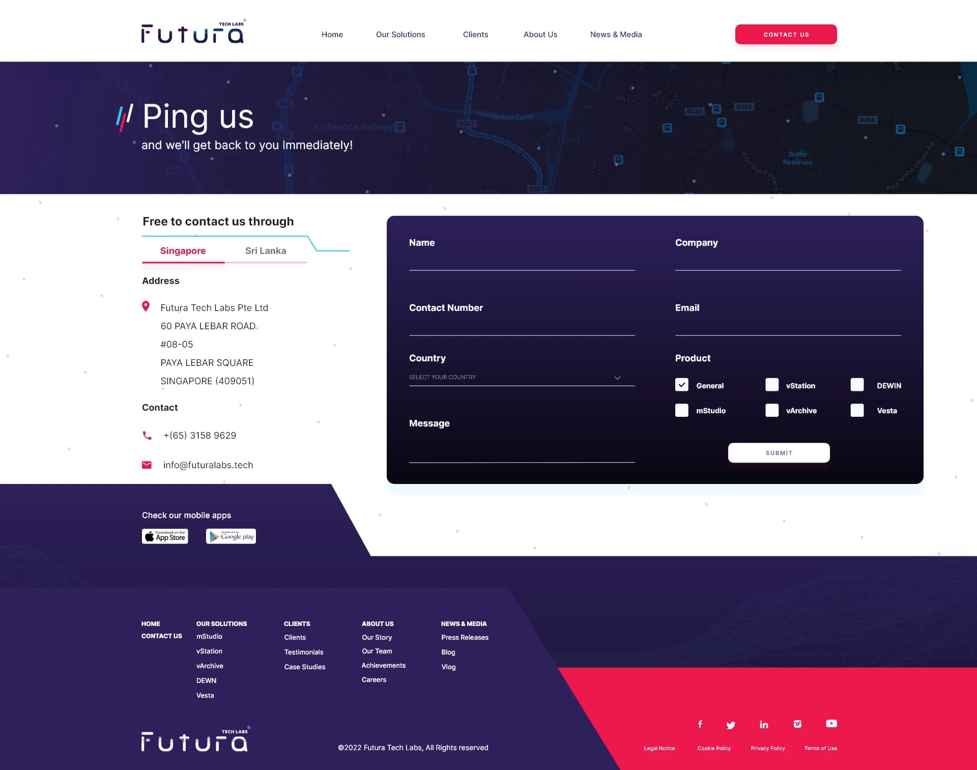
Every page in the sitemap was designed in Adobe XD — from the rotating product hero on the homepage to the dual-country contact form. The DEWN page was treated with a deliberately different tone: dramatic visuals and life-safety messaging for a government/emergency audience, contrasted against the commercial tone of the product pages.
The Outcome
Launched on time.
Exactly what they asked for.
What was delivered
- 15+ fully designed page UIs in Adobe XD
- Complete design system — colours, typography, component patterns
- Responsive layouts prepared for developer handoff
- 4 product pages with tabbed deep-dive content system
- News, Blog, Vlog, About, Clients, and Contact pages
- Handed off to Futura's internal team for WordPress + Elementor build
“They wanted futuristic and uncommon — so that's exactly what I gave them.”
Website Analytics
September 2022 – March 2026
20,870
Total Users
23,501
Sessions
82,138
Page Views
1m 42s
Avg. Session
Device Breakdown
Traffic Sources
Top Countries
Source: Google Analytics 4 · Sep 1, 2022 – Mar 31, 2026
Gallery
All 15+ pages.
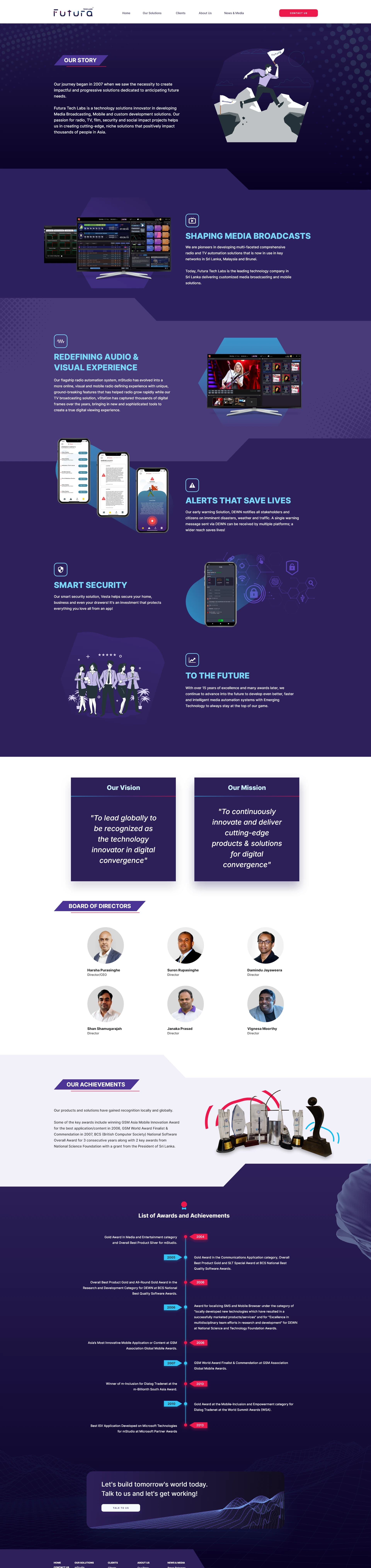
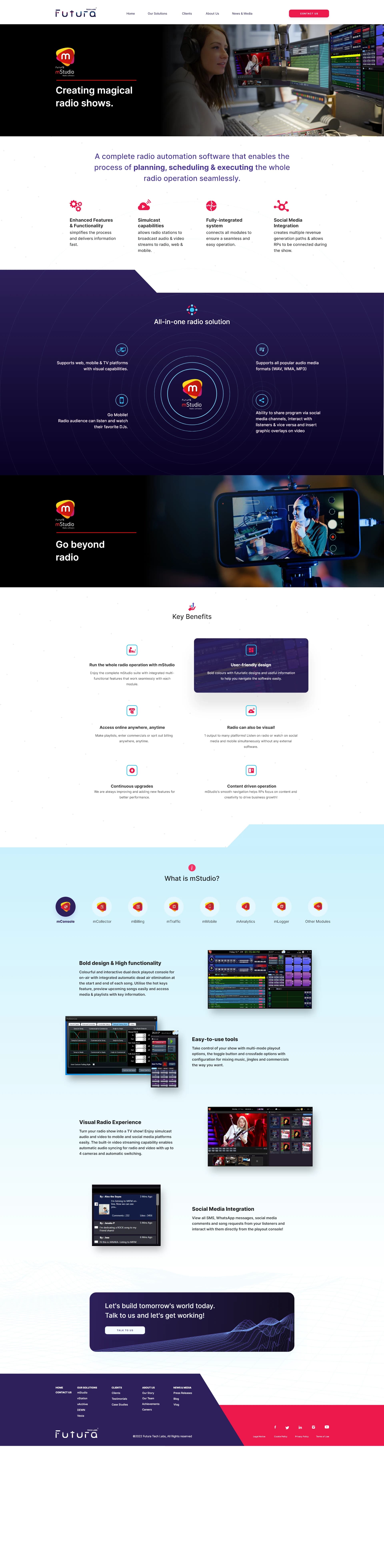
From the rotating hero banners on the homepage to the dual-country contact form.
What I Learned
Architecture first.
Aesthetics second.
This project pushed me to think beyond how things look. With 5 enterprise products each serving a completely different audience, the real design challenge was information architecture and content strategy — how things were structured and sequenced, not just how they appeared.
The tabbed product page pattern developed for mStudio became a reusable solution across all 5 products. The diagonal design language gave the site a signature feel consistent across 15+ very different pages. Working directly from the client's content document was also a lesson in meeting people where they're comfortable — rather than imposing a design-only workflow.
Skills demonstrated
- UX Information Architecture
- Complex content hierarchy design
- Multi-product design system creation
- Enterprise B2B web design
- Client collaboration and briefing
Let's build somethingremarkable together.Get in touch!
Open to freelance projects & new collaborations.