Yupun
Abeykoon
A personal brand identity for South Asia's fastest man — built for speed, legacy, and a career that rewrites records.
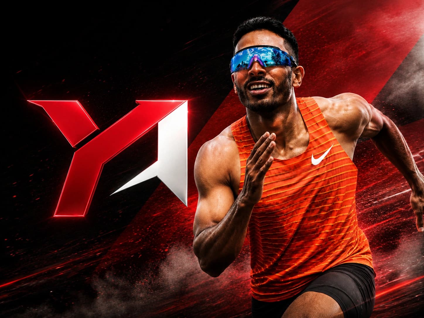
The Athlete
South Asia's
Fastest Man.
Yupun Abeykoon is Sri Lanka's most celebrated professional sprinter — a trailblazer who made history by becoming the first South Asian athlete to break the 10-second barrier in the 100 metres. His achievement didn't just set a regional record; it fundamentally changed what South Asian athletics could aspire to.
A gold medallist at the South Asian Games and a regular competitor on the Asian athletics circuit, Yupun is building a career that transcends sport. With that level of recognition comes the responsibility to show up with a personal brand that matches the ambition — one that travels as far as the records do.
9.96s
100m Personal Best
1st
South Asian Sub-10 Athlete
Gold
South Asian Games
Asian
Athletics Championship

The Brief
A mark worthy of
the record books.
An athlete at Yupun's level needs more than a logo — he needs a symbol. One that works on a medal podium backdrop, a social media thumbnail, a sports jersey, and a global press release. The ask was unambiguous: bold, geometric, and built to last.
Speed & Power
The mark had to communicate explosive athletic ability at a single glance — no room for soft or ambiguous forms.
Identity, Not Initials
More than a lettermark. The icon needed to function as a symbol — one that works even without the athlete's name attached.
Full Versatility
Jersey patches, social profiles, merchandise, event backdrops — every context demands a different format and colorway.
Legacy-Ready
Not trendy. Not of-the-moment. This mark must still feel right in 20 years when Yupun is a coaching legend.
Research & Ideation
From track
to mark.
Research began by studying the visual language of elite athletes. Usain Bolt's lightning bolt. Michael Jordan's Jumpman. Roger Federer's RF monogram. The through-line: the best athlete logos are iconic symbols — not photographs, not literal running figures, not initials in a circle.
From there, I mapped Yupun's core brand pillars — the words and feelings his personal brand must own — and used those as the creative brief for ideation.
Speed — Sub-10 seconds. The fastest athlete in a continent of 2 billion people.
Power — Explosive starts. Relentless forward momentum. Zero hesitation.
Precision — Every millisecond engineered. Every movement calculated.
Sri Lankan — Proud, nationally celebrated, and now globally recognised.
Direction A
Typographic
Direction B
Symbol Mark
Direction C
Combination ✓
Design Process
How the mark was made.
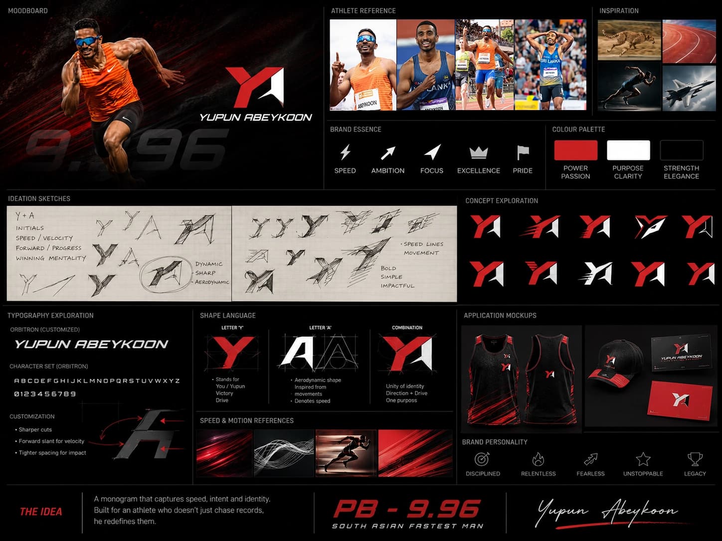
Athlete Research
Before sketching a single line, I studied Yupun — his athletic journey, the visual identity of elite sprinters globally, and what makes an athlete's personal brand endure beyond their competitive years. Athletes like Usain Bolt, who owns one of the most recognisable personal logos in sport, set the benchmark. The brief demanded something equally distinctive but unmistakably Sri Lankan.
Concept Ideation
Three distinct directions were explored: a pure typographic mark built entirely from letterforms; a symbol mark driven by motion and velocity; and a combination mark that fuses icon and wordmark. The combination approach won — it gives maximum flexibility across all media while telling a clear story at a glance, with or without the name attached.
Building the Mark
The icon was constructed from three precise geometric polygons. The two crimson shapes form a stylised 'Y' that simultaneously reads as a lightning bolt — explosive, directional, and unmistakable. The third shape, anchored in black, adds dimensional depth and grounds the forward thrust of the mark. Every angle was calibrated to read with equal clarity at thumbnail size and billboard scale.
Wordmark & Logo System
The wordmark 'YUPUN ABEYKOON' was crafted with a custom geometric approach — angular, tightly spaced, and technically precise — mirroring the sharpness of the icon without competing with it. Eight final variations were then prepared: full logo and icon-only, each delivered in four colorway combinations to cover every possible application context.
The Mark
The final logo.
Three polygons. One unmistakable identity. A symbol that reads simultaneously as a letter, a lightning bolt, and a figure in full flight.
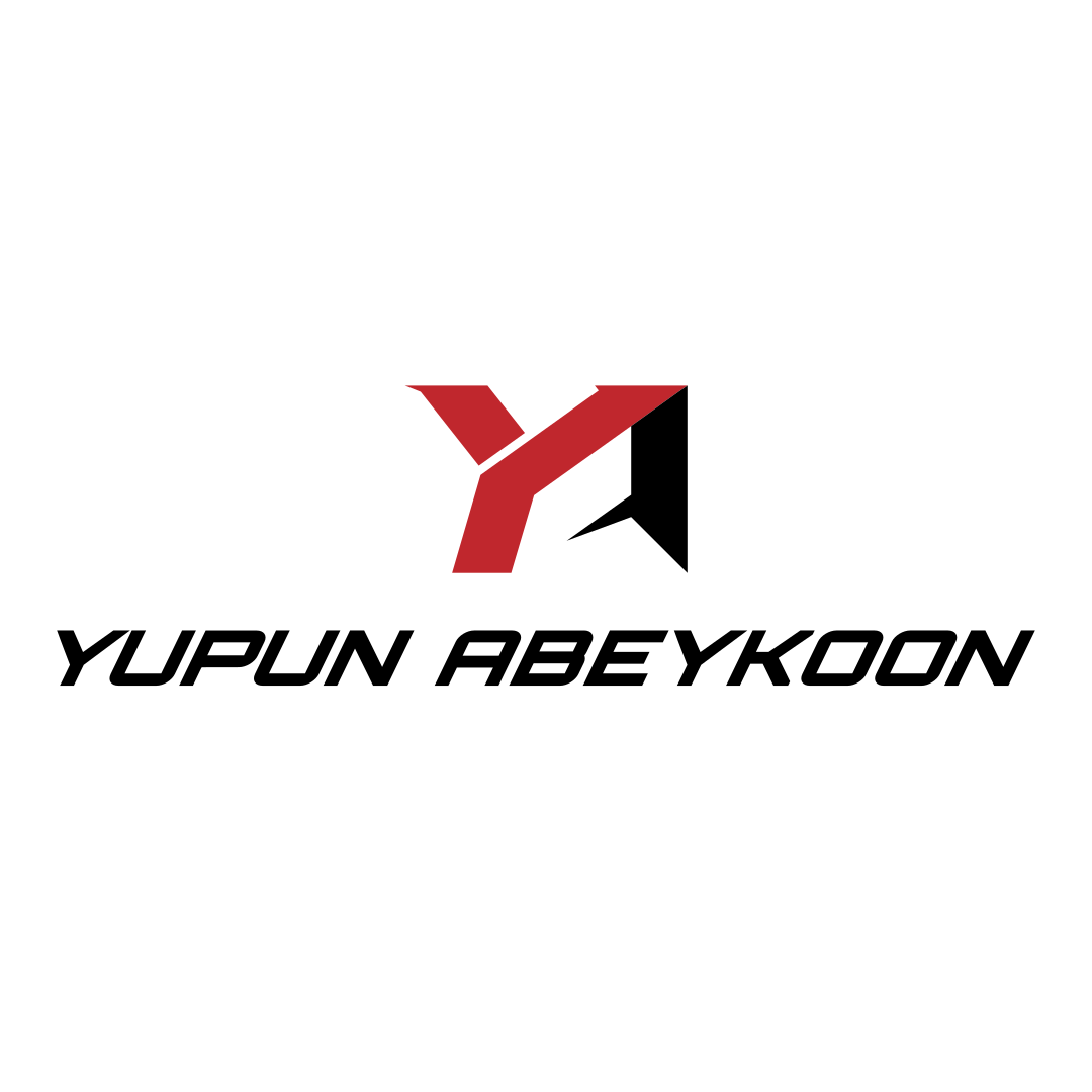
The 'Y' Mark
A stylised 'Y' — the athlete's initial — that simultaneously reads as a lightning bolt. Explosive, directional, unmistakable.
The Thrust
The black polygon grounds the mark and creates a clear sense of forward momentum — the physics of a sprint start, frozen in geometry.
The Wordmark
Custom geometric letterforms: angular, tight, and precisely calibrated to complement the icon without competing with it.
Color System
Three colors.
Total clarity.
A deliberately restrained palette. Crimson for passion and speed. Black for authority and precision. White for versatility and breathing room.
Crimson
#C0272D
Primary · Speed · Passion
Black
#000000
Secondary · Strength · Authority
White
#FFFFFF
Tertiary · Clean · Versatile
Logo System
8 variations.
Every context covered.
Full logo and icon-only, each in four colorway combinations — ensuring the mark works on any background, at any size, in any medium.
Primary Logo
Full Logo — Dark

Reversed — Dark
Monochrome — Light
Primary Icon

Icon — Dark

Icon Reversed — Dark
Icon Mono — Light
Logo in Context
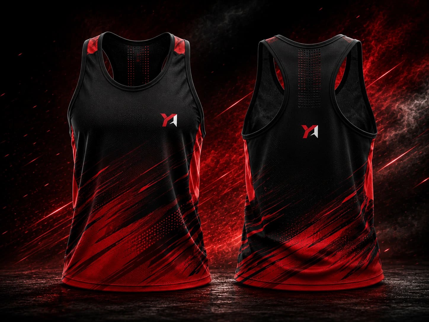
Sports Jersey
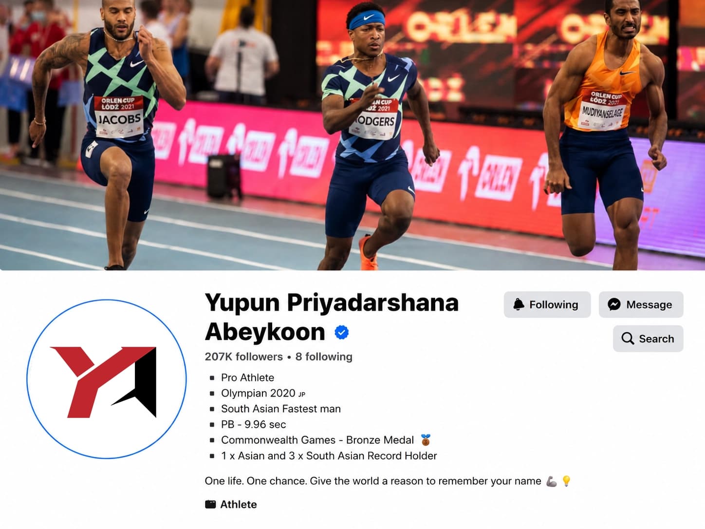
Social Media
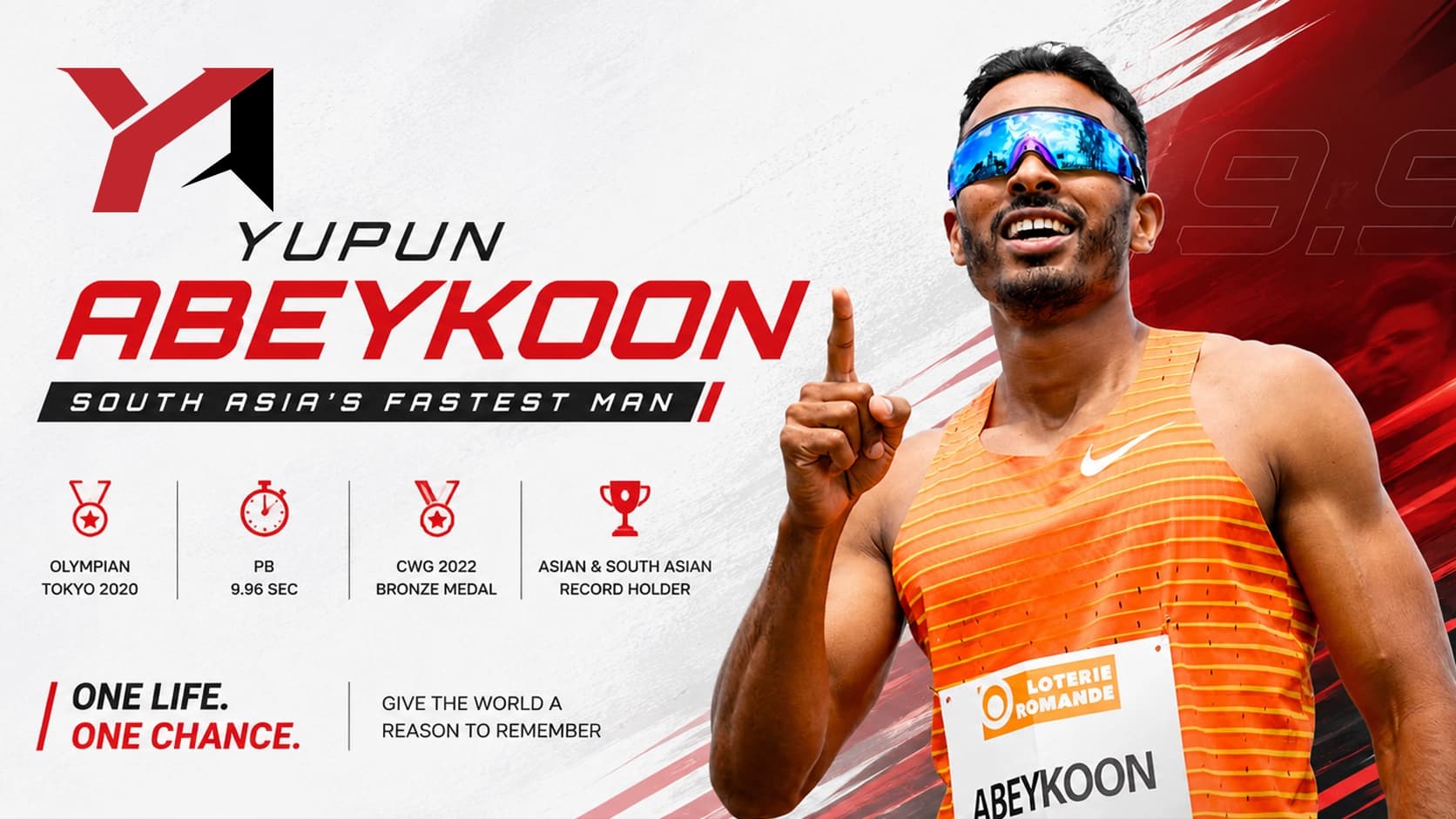
Event Banner
Logo in Motion
The reveal.
Every great brand deserves a grand entrance. A motion reveal was created to introduce the mark — showing the three geometric elements assembling into the complete logo, each layer landing with purpose.
Deliverables
What was delivered.
- Primary logo — icon mark + custom wordmark combination
- Standalone icon mark for compact and social usage
- 4 colorway variations for each logo type (8 total)
- All files in SVG vector format for infinite scalability
- Optimised for both digital screens and print production
- Full coverage across light and dark background contexts
What I Learned
Symbol first.
Always.
Designing for a real, high-profile individual raises the stakes considerably. The mark doesn't represent a product — it represents a person, their career, their legacy. That weight clarified something: a great personal logo must be a symbol, not a decoration.
The geometric approach — reducing identity to its absolute essentials — proved to be the right call. Three shapes. One idea. That kind of clarity is exactly what makes a mark work at both thumbnail size and stadium scale.
“Shamal turned my vision into a logo masterpiece! From concept to final design, his professionalism and creativity were top-notch. He truly understood my brand and delivered a logo that's both beautiful and impactful.”
Let's build somethingremarkable together.Get in touch!
Open to freelance projects & new collaborations.