Geometry
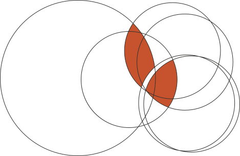
Every segment begins as overlapping circles. The ring follows a repeatable geometry, so every curve traces back to one disciplined shape.

Brand Identity · Concept Study
A circular-plastics brand for Phoenix Industries, inspired by the natural process of serotiny: holding potential until the moment it can begin again.
View the Serotiny storyDate
August 2026
Competition
PAD Awards 2026 · Brands for Life
Tools
Adobe Illustrator · Figma
Type
Concept Brand Identity
Role
Independent Designer
The real serotiny
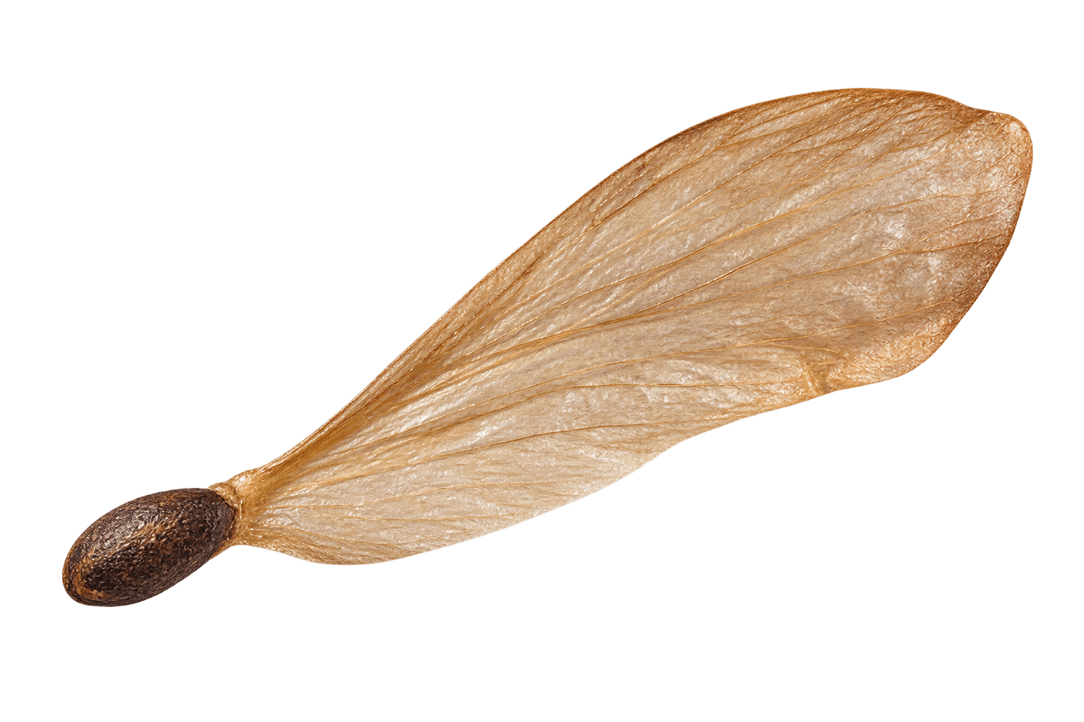
Serotiny is a real botanical phenomenon: some woody cones remain sealed by resin, holding their seeds until intense heat melts that seal. The plant doesn't release them by choice; it needs fire, force, a genuine turning point, before new life can begin.
That idea—dormant material waiting for the right conditions to become something new—is where this brand starts. Pressure is the material metaphor that carries the story into Phoenix's world.

Dormant.
Sealed by resin, holding its seeds.

Released.
Heat breaks the seal—the seed is free.
AI-generated concept imagery—not photographs of an actual specimen.
Icon construction
The Signature Ring is not decorative. Its construction connects geometry, natural cycles and the everyday rhythm of time—giving the identity a logic that can be seen as well as felt.
Geometry
Every segment begins as overlapping circles. The ring follows a repeatable geometry, so every curve traces back to one disciplined shape.
Cycles
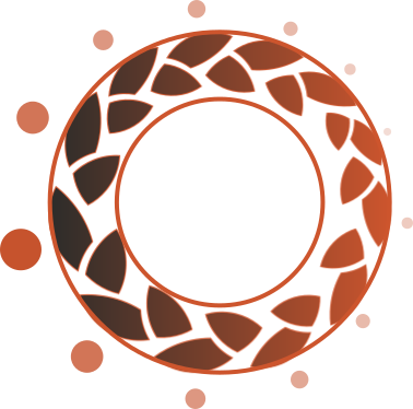
Twenty-four segments form twelve paired moments that taper around the ring: growth, stillness, then a return to the beginning.

Time
There is one segment for every hour in a day. The mark turns the practical rhythm of time into a quiet sign of renewal.
The idea
Serotiny connects an ecological phenomenon to a material one. A pine cone protects its seeds until heat opens it; Serotiny sees post-consumer plastic as the same kind of stored possibility—ready to be collected, transformed and used again.
The identity begins with material held under tension: plastic waste, stored potential and a cone that waits for the right conditions.
Heat does not destroy the cone. It opens its scales, making room for what it has held to move into the world.
The brand turns that release into a practical circular system: collect, reform and keep useful material in use.
The mark
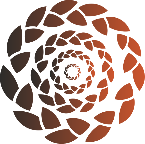
The symbol borrows from the opening cone: individual scales create a circular path rather than a closed seal. It is intentionally alive—an emblem of release, renewal and a material loop that keeps moving.
Logo variations
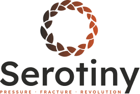
Four lockups cover every application, each carried in a dark ink for light surfaces and a light ink for dark surfaces.
Icon Mark


Stacked Lockup
Horizontal Lockup


Compact Lockup


The system
A restrained palette gives the identity its duality: charred charcoal for material resilience, ember rust for energy and transformation, and cream for the practical everyday world it is designed to enter.
#2C2C2A
Charcoal
#C6532D
Ember Rust
#F5F1EA
Warm Cream
From mark to material
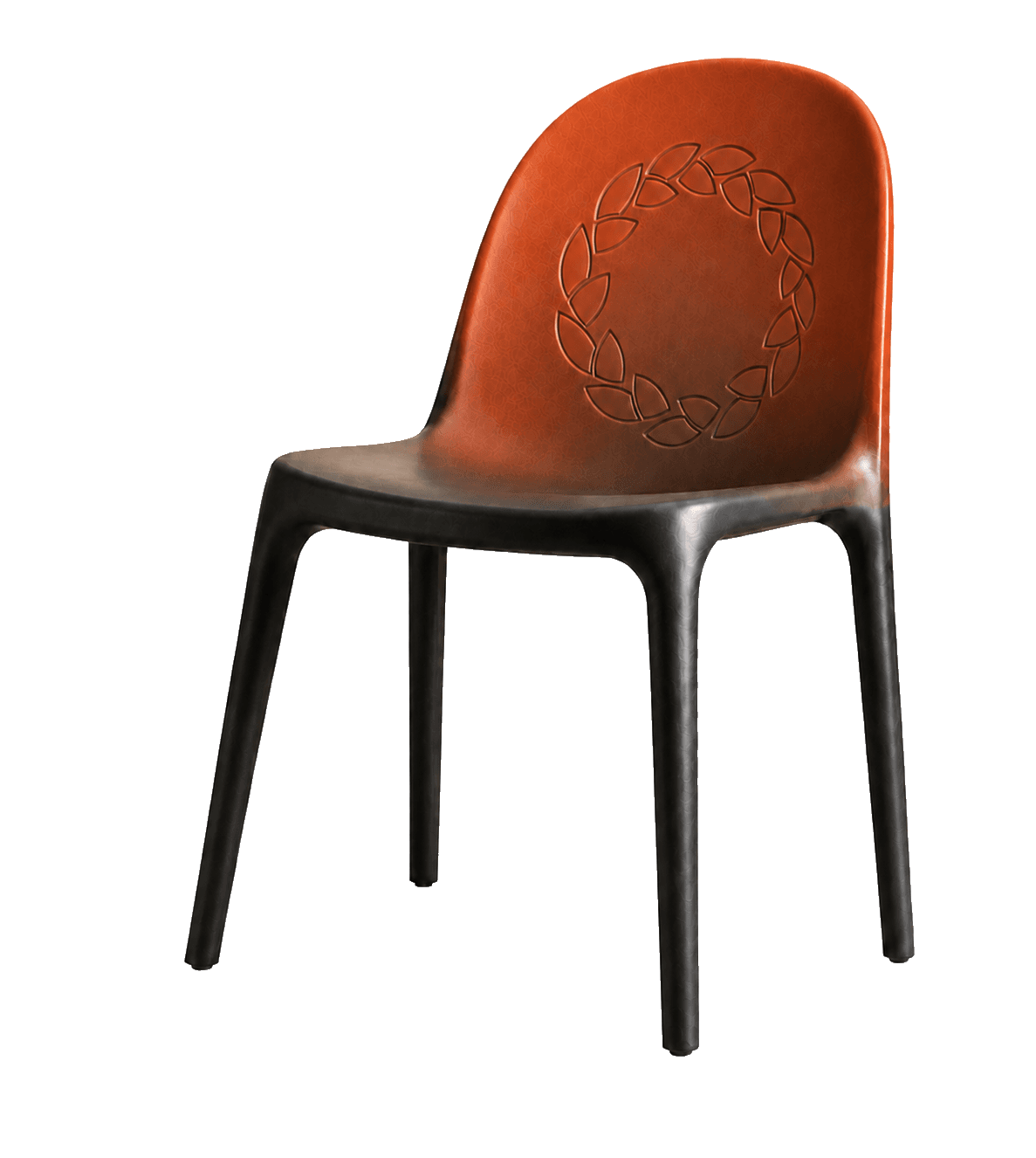
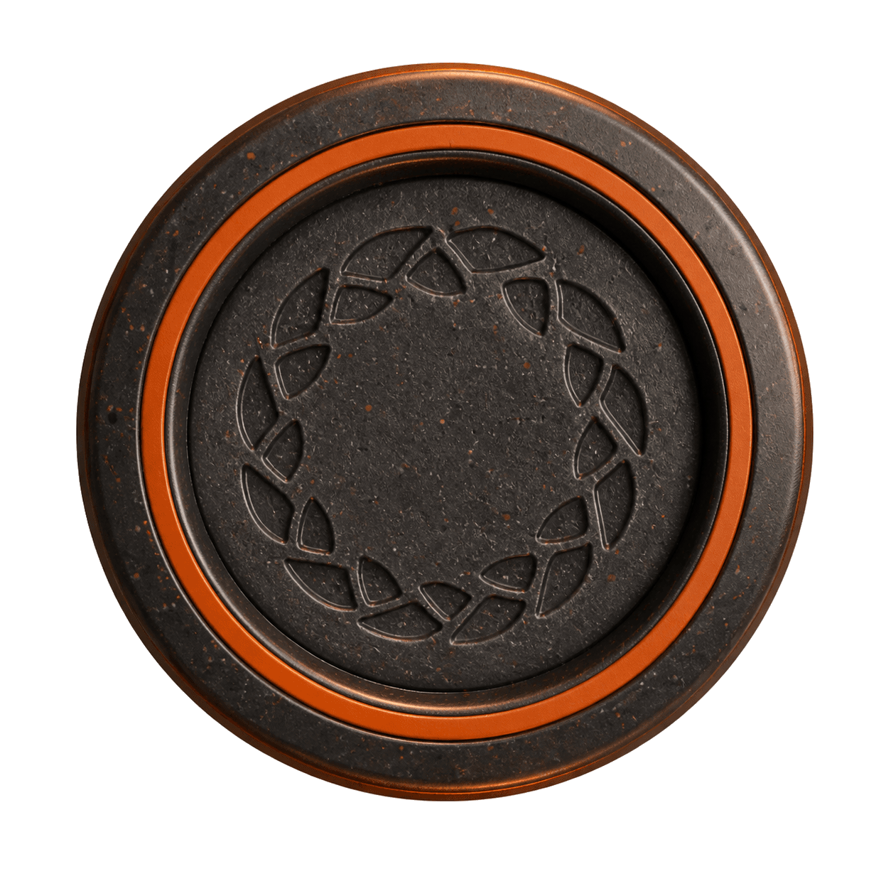
The identity is not treated as a label applied after the fact. The circular mark becomes an engraved surface, a recognisable backrest detail and a subtle signal across Serotiny's product family.
Reading the mark
The Signature Ring has no start and no end: a closed loop, not a line. Twenty-four segments form the ring—one for every hour in a day—so the mark carries a cycle of material, time, and renewal.
Ash is the charcoal stage; Ignition is the ember-rust stage where heat releases the seal. Together they form one continuous story: ash, ignition, revolution, then the cycle turns again.
Font usage
Lexend is the sole typeface across the Serotiny identity, one family, five weights, used consistently everywhere it appears.
Display / Headline
Bold · Largest
Serotiny
Section Title
SemiBold · Large
Reading the Mark
Subhead
Medium · Medium
Pressure. Fracture. Revolution.
Body Copy
Regular · Base
Some things only open under pressure.
Label / Eyebrow
SemiBold, uppercase · Small, letter-spaced
LOGO & MARK
Bold and SemiBold carry the brand's confidence, reserve them for headlines and section titles. Body copy stays at Regular for readability at length. Labels and eyebrows always use SemiBold with added letter-spacing, uppercase, to read as structural markers rather than sentences. Avoid Light or Thin weights below 24px, they lose legibility and undercut the engineered, confident tone of the identity.
Surface Pattern · Infinite repeat
Pattern & graphic language
Serotiny works through two connected systems. The Signature Ring is the complete 24-segment mark: a focal point for logos, moulded product details, functional perforations, and day markers. The Surface Pattern releases one leaf-shaped segment into a repeat, creating texture and scale across backgrounds, wraps, and environmental graphics. Use the Signature Ring sparingly and with purpose; use the Surface Pattern to build atmosphere without competing with the mark.
Environmental mockup
The identity has to hold up beyond the page—on a building, a street, or an event floor. The Signature Ring creates recognition at a distance; the Surface Pattern adds texture where an application needs scale. Together, they keep the system restrained, adaptable, and unmistakably Serotiny.
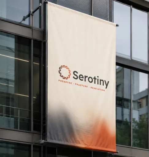
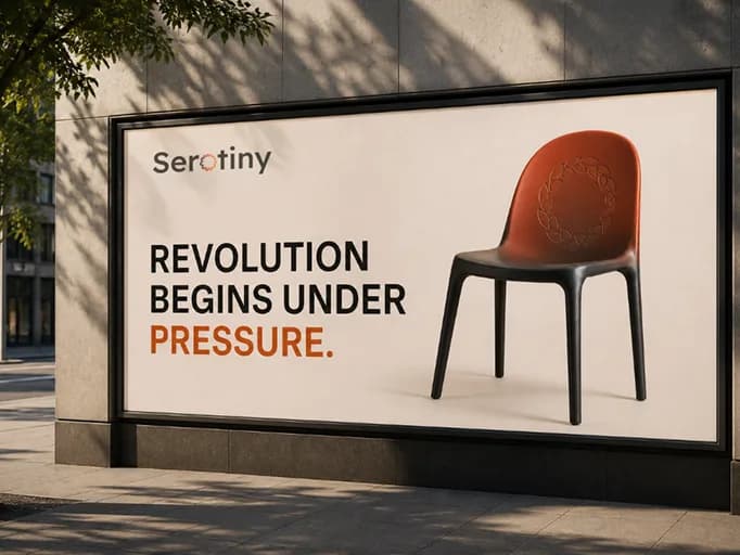
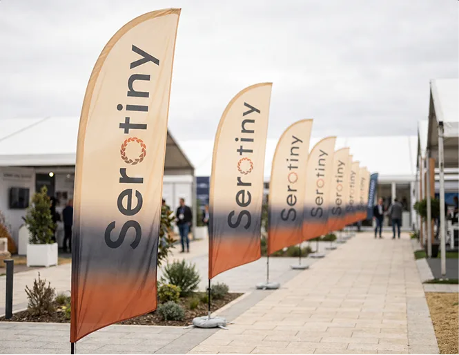
AI-generated concept renders — not photographs of actual installations.
Brand in social media
Product, material, and everyday ritual move through one feed. Each post uses a consistent Ash-to-Ignition palette, confident typography, and a controlled use of the Signature Ring or Surface Pattern—so variety never breaks the system.
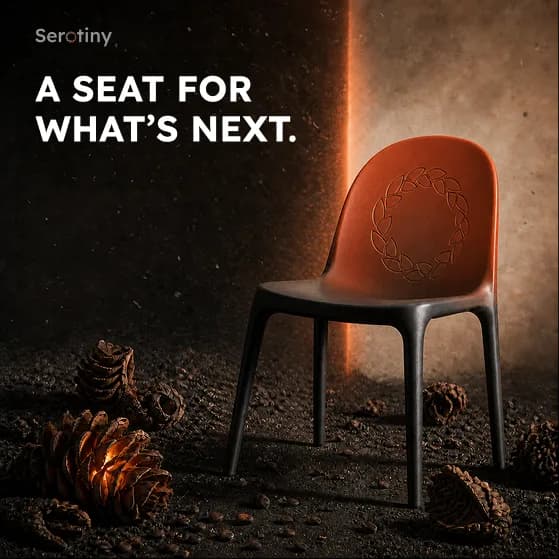
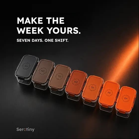
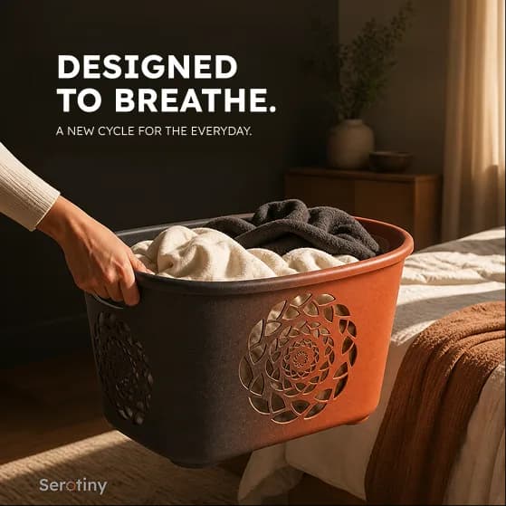
AI-generated concept renders — not photographs of actual installations.
Brand applications
Apparel and carry goods make the identity personal. The Signature Ring holds attention at focal points; the Surface Pattern carries scale through fabric, packaging, and repeatable everyday objects.
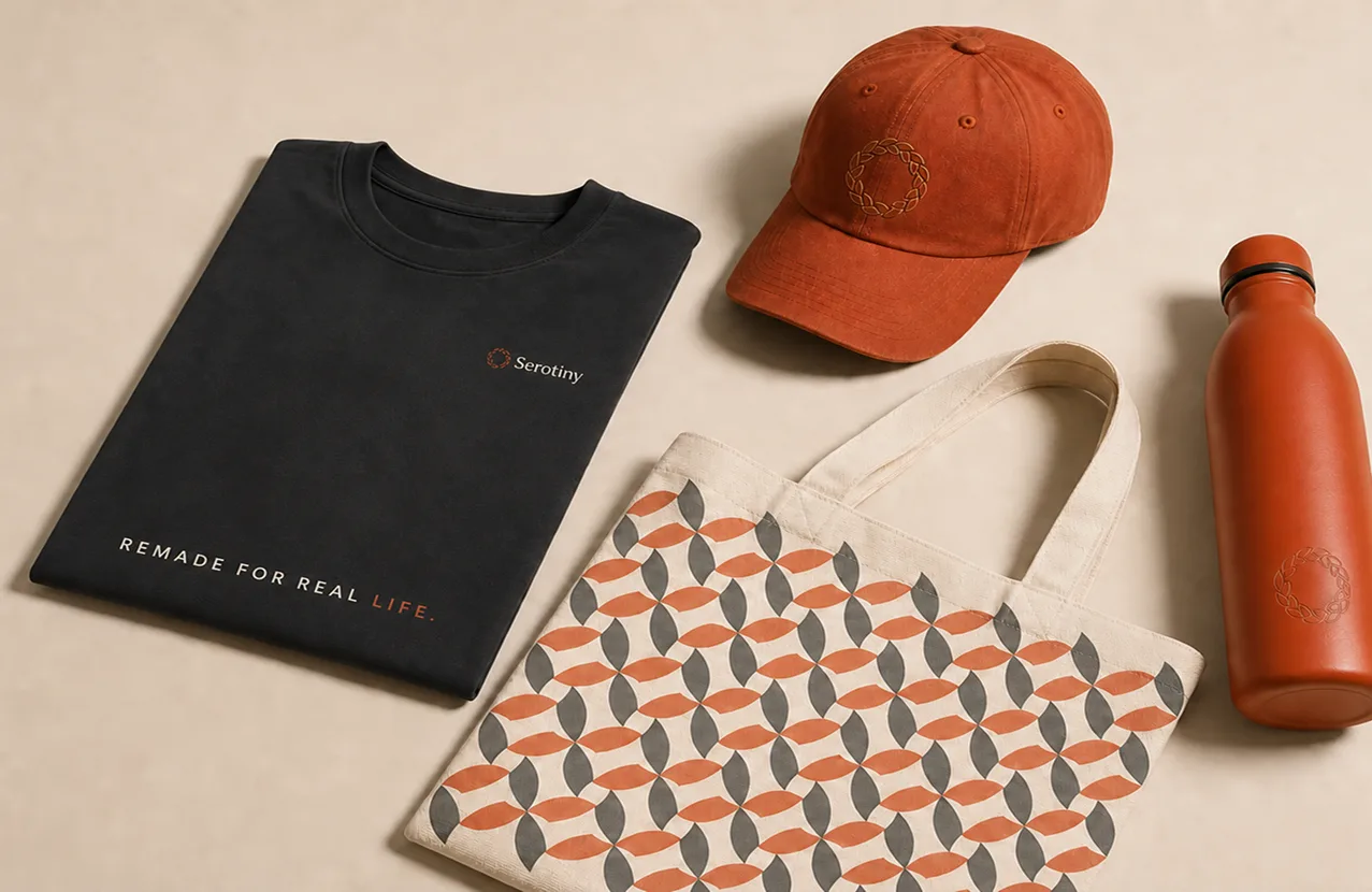
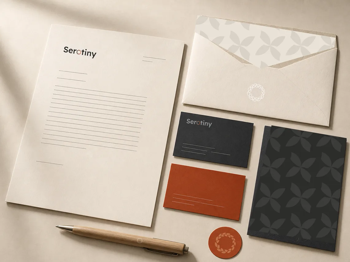
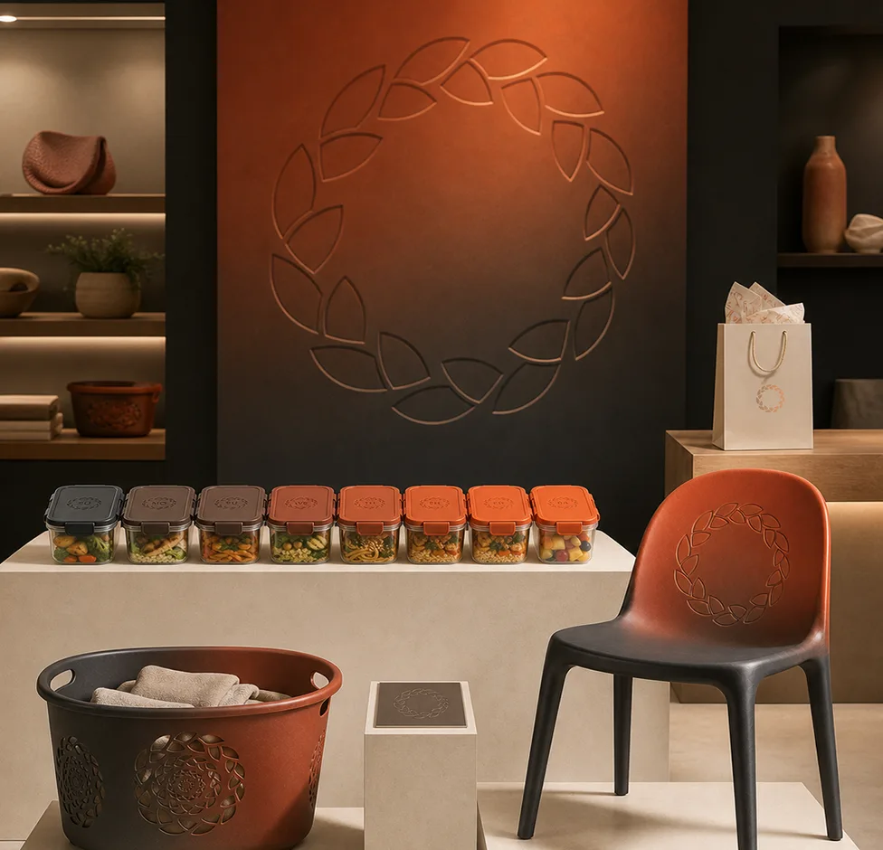
AI-generated concept renders — not photographs of actual installations.
Live digital experience
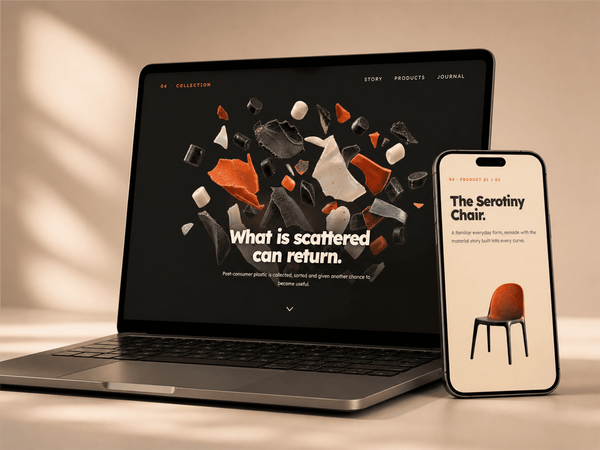
Explore Serotiny online—a scroll-led brand story that follows pressure, release and recovery into products made for everyday life.
Open to freelance projects & new collaborations.